Optimising Pull & Bear
Optimising Pull & Bear
Optimising Pull & Bear
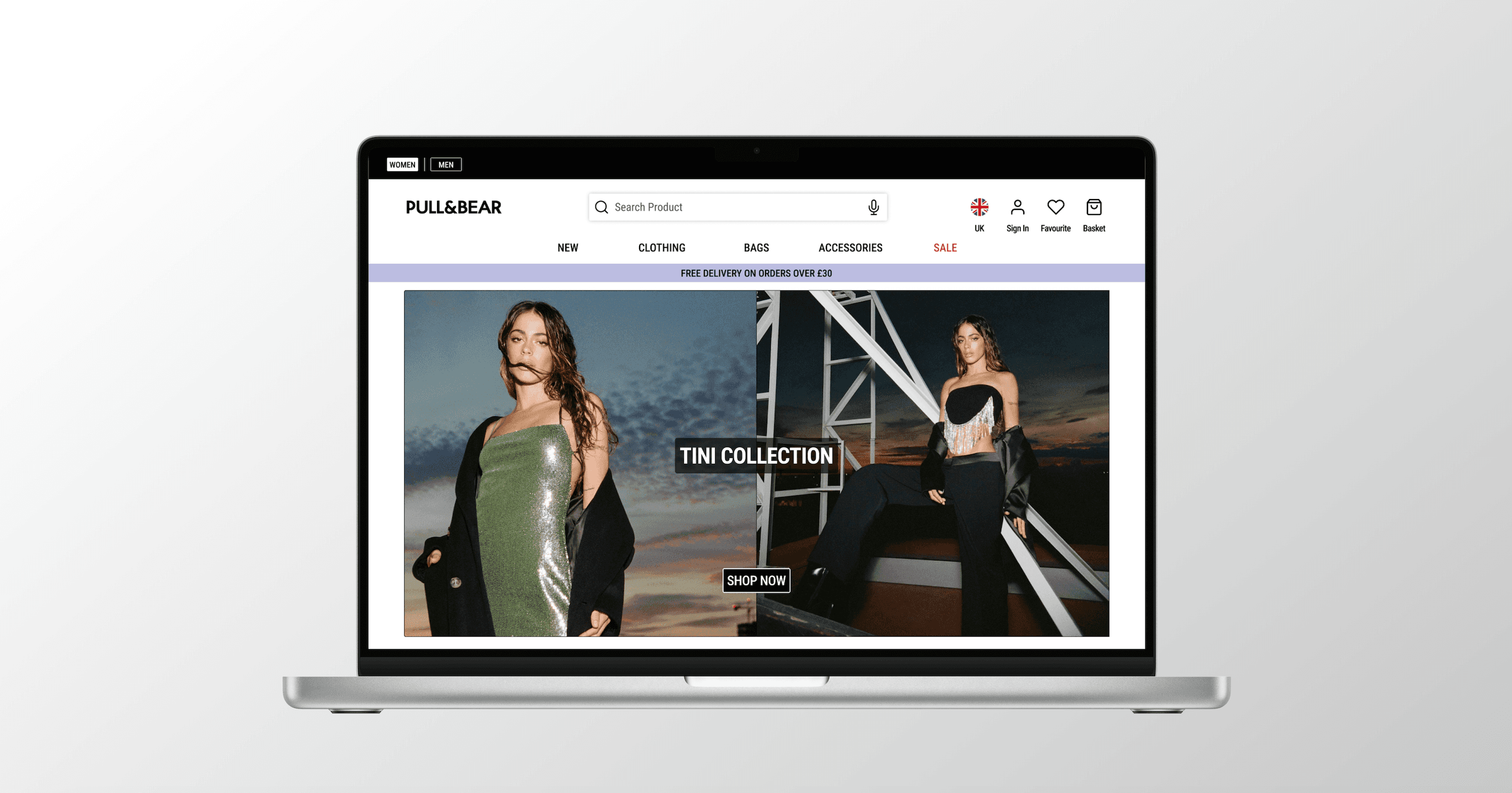
Exploring the user journey, identifying user pain points and implementing refinements to improve the overall user experience and increase customer retention.


Role
Role
Sole UX/UI Designer
Sole UX Researcher
Sole UX/UI Designer
Sole UX Researcher
Sole UX/UI Designer
Sole UX Researcher
Time
Time
3 - 4 Weeks
3 - 4 Weeks
3 - 4 Weeks
Tool
Tool
Figma
Google Forms
Figma
Google Forms
Figma
Google Forms
Problem
Problem
Problem
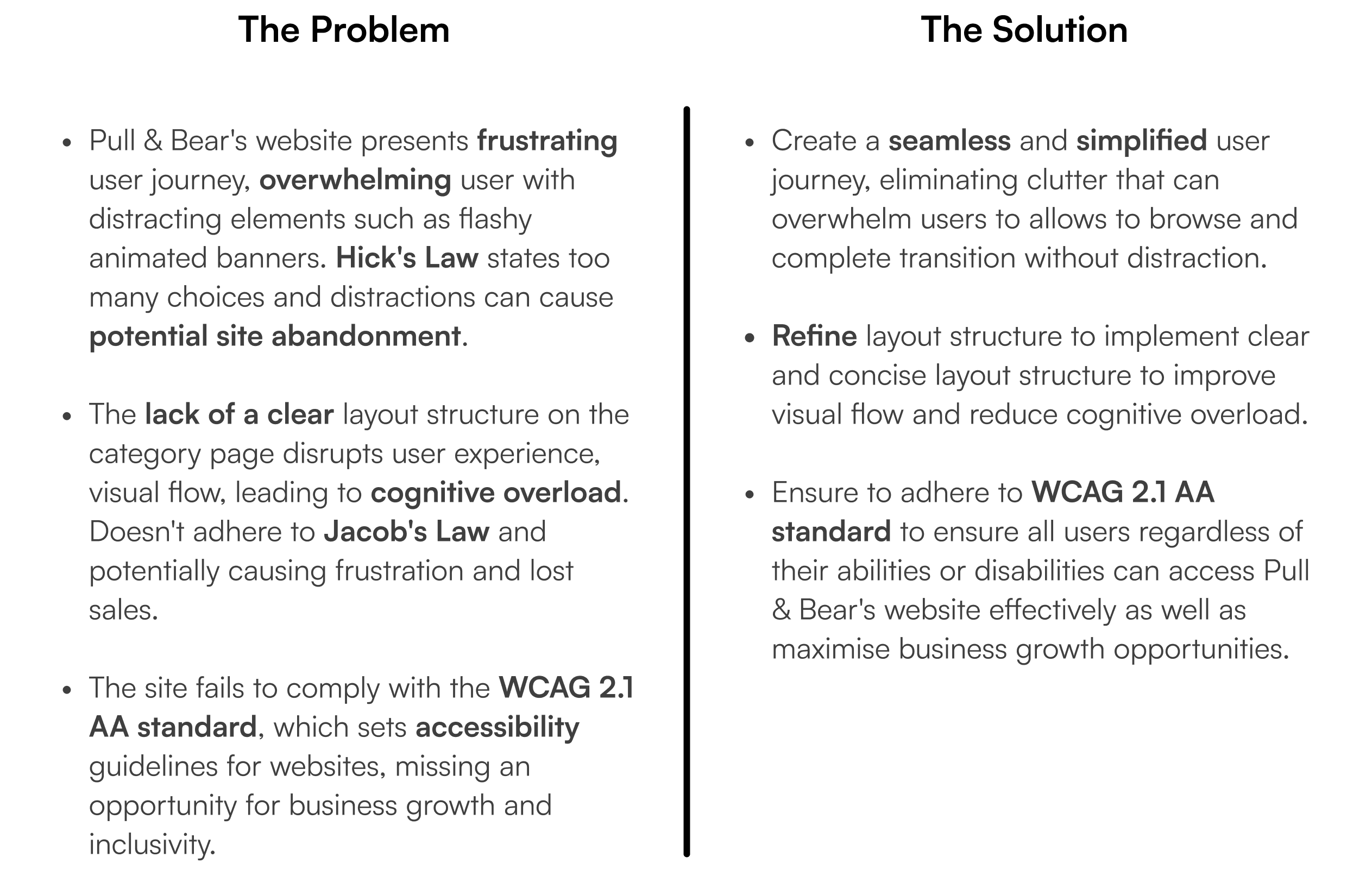
Pull & Bear's current website struggles with inconsistencies in its layout and adhering to the web accessibility WCAG 2.1 AA standards. These issues disrupt the user journey, from browsing to checkout, leading to site abandonment, which negatively impacts customer retention and sales.
Pull & Bear's current website struggles with inconsistencies in its layout and adhering to the web accessibility WCAG 2.1 AA standards. These issues disrupt the user journey, from browsing to checkout, leading to site abandonment, which negatively impacts customer retention and sales.
Pull & Bear's current website struggles with inconsistencies in its layout and adhering to the web accessibility WCAG 2.1 AA standards. These issues disrupt the user journey, from browsing to checkout, leading to site abandonment, which negatively impacts customer retention and sales.
Solution
Solution
Solution
To enhance the user experience on the site, I created an intuitive and simplified user flow that reduces distractions and enables users to complete the end-to-end journey. This will motivate users to browse and complete purchases seamlessly, resulting in increased customer engagement, decreased site abandonment, and growth in customer retention and online sales for Pull & Bear.
To enhance the user experience on the site, I created an intuitive and simplified user flow that reduces distractions and enables users to complete the end-to-end journey. This will motivate users to browse and complete purchases seamlessly, resulting in increased customer engagement, decreased site abandonment, and growth in customer retention and online sales for Pull & Bear.
Overview
Overview
Overview
The pandemic has accelerated online shopping to new heights, and the demand shows no signs of slowing down. Consumers expect a seamless online experience when shopping online. To ensure online sales growth, e-commerce sites are expected to create a positive user experience to avoid user frustration and website abandonment, which can lead to a drop in sales and customer retention. For brands like Pull & Bear, a trend-driven fashion brand primarily relying on online sales to reach its younger audience, optimising the user journey is critical.
The pandemic has accelerated online shopping to new heights, and the demand shows no signs of slowing down. Consumers expect a seamless online experience when shopping online. To ensure online sales growth, e-commerce sites are expected to create a positive user experience to avoid user frustration and website abandonment, which can lead to a drop in sales and customer retention. For brands like Pull & Bear, a trend-driven fashion brand primarily relying on online sales to reach its younger audience, optimising the user journey is critical.
The pandemic has accelerated online shopping to new heights, and the demand shows no signs of slowing down. Consumers expect a seamless online experience when shopping online. To ensure online sales growth, e-commerce sites are expected to create a positive user experience to avoid user frustration and website abandonment, which can lead to a drop in sales and customer retention. For brands like Pull & Bear, a trend-driven fashion brand primarily relying on online sales to reach its younger audience, optimising the user journey is critical.
Empathy
Empathy
Pull & Bear
Pull & Bear
Pull & Bear is a global fashion brand with stores in over 80 countries. It offers affordable, trendy clothing for men and women. It is part of the Inditex group and is known for its casual styles inspired by international fashion trends. Choosing Pull & Bear for this UX project because it has a limited store presence currently in the UK relying on its website to reach its target audience and capture online sales.
Pull & Bear is a global fashion brand with stores in over 80 countries. It offers affordable, trendy clothing for men and women. It is part of the Inditex group and is known for its casual styles inspired by international fashion trends. Choosing Pull & Bear for this UX project because it has a limited store presence currently in the UK relying on its website to reach its target audience and capture online sales.
Pull & Bear is a global fashion brand with stores in over 80 countries. It offers affordable, trendy clothing for men and women. It is part of the Inditex group and is known for its casual styles inspired by international fashion trends. Choosing Pull & Bear for this UX project because it has a limited store presence currently in the UK relying on its website to reach its target audience and capture online sales.


Current Website
Current Website




Trust Pilot
Trust Pilot
To gain a better insight, I reviewed customer feedback on Trustpilot to understand how users felt about their experience on Pull & Bear's website. This helped identify common pain points and opportunities for improvement.
To gain a better insight, I reviewed customer feedback on Trustpilot to understand how users felt about their experience on Pull & Bear's website. This helped identify common pain points and opportunities for improvement.
To gain a better insight, I reviewed customer feedback on Trustpilot to understand how users felt about their experience on Pull & Bear's website. This helped identify common pain points and opportunities for improvement.
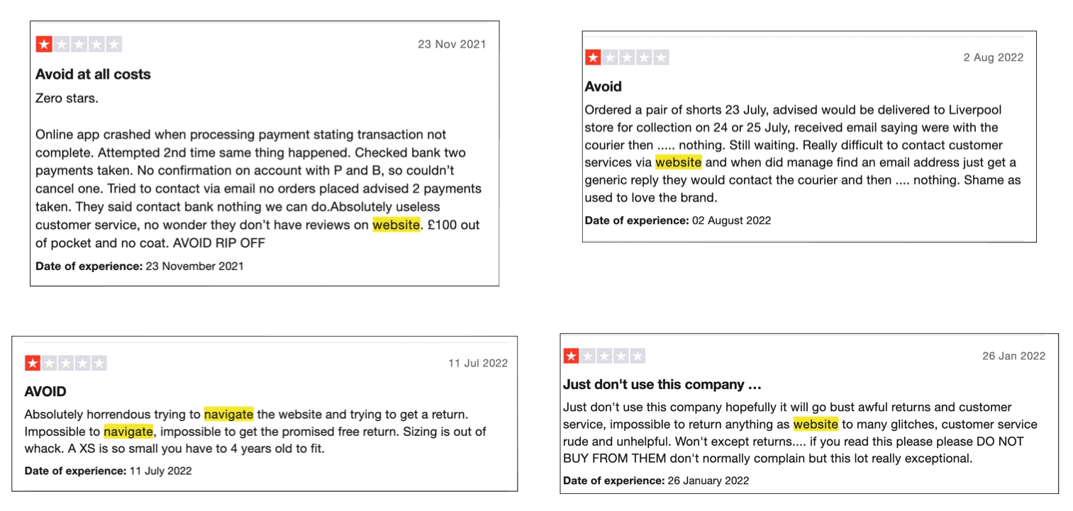


Key Findings:
Users expressed frustration when trying to access customer service on the website.
Users experienced difficulties navigating the site, which negatively impacted their shopping experience.
The site's complex navigation made it challenging for users to request a return.
Key Findings:
Most customers expressed difficulty in seeking out customer service
Difficulty navigating the website
Difficulty making a return: users users express that the journey is complex and difficult to complete.
Key Findings:
Most customers expressed difficulty in seeking out customer service
Difficulty navigating the website
Difficulty making a return: users users express that the journey is complex and difficult to complete
User Research
User Research
Competitive Analysis
Competitive Analysis
Conducting a competitive analysis will help me identify my competitors' strengths and weaknesses. With this information, I'll be able to improve users' journeys and overall experience. I've chosen my competitors based on similar target audiences. I've chosen two direct competitors (Bershka and H&M) and one indirect competitor (ASOS).
Conducting a competitive analysis will help me identify my competitors' strengths and weaknesses. With this information, I'll be able to improve users' journeys and overall experience. I've chosen my competitors based on similar target audiences. I've chosen two direct competitors (Bershka and H&M) and one indirect competitor (ASOS).
Conducting a competitive analysis will help me identify my competitors' strengths and weaknesses. With this information, I'll be able to improve users' journeys and overall experience. I've chosen my competitors based on similar target audiences. I've chosen two direct competitors (Bershka and H&M) and one indirect competitor (ASOS).
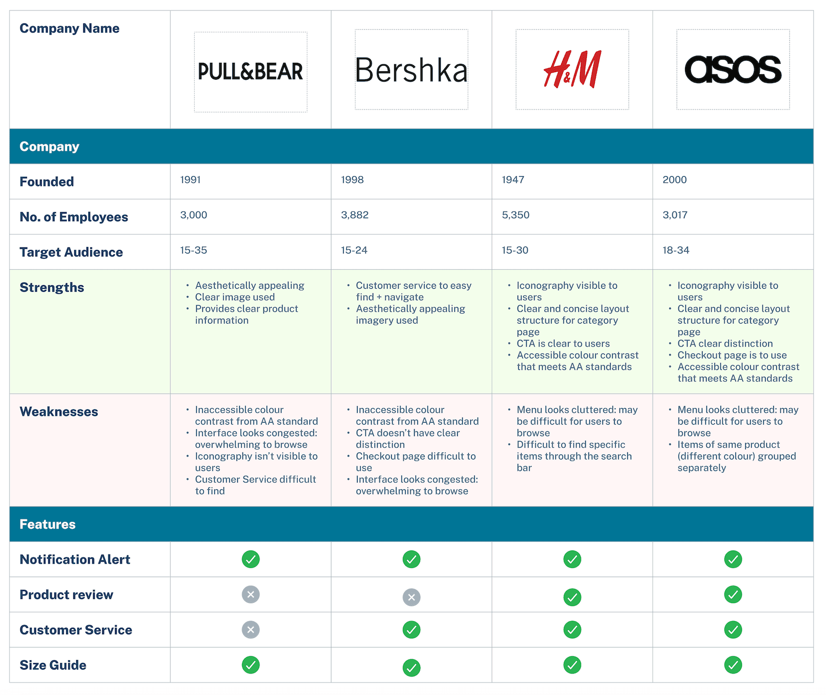


Key Findings:
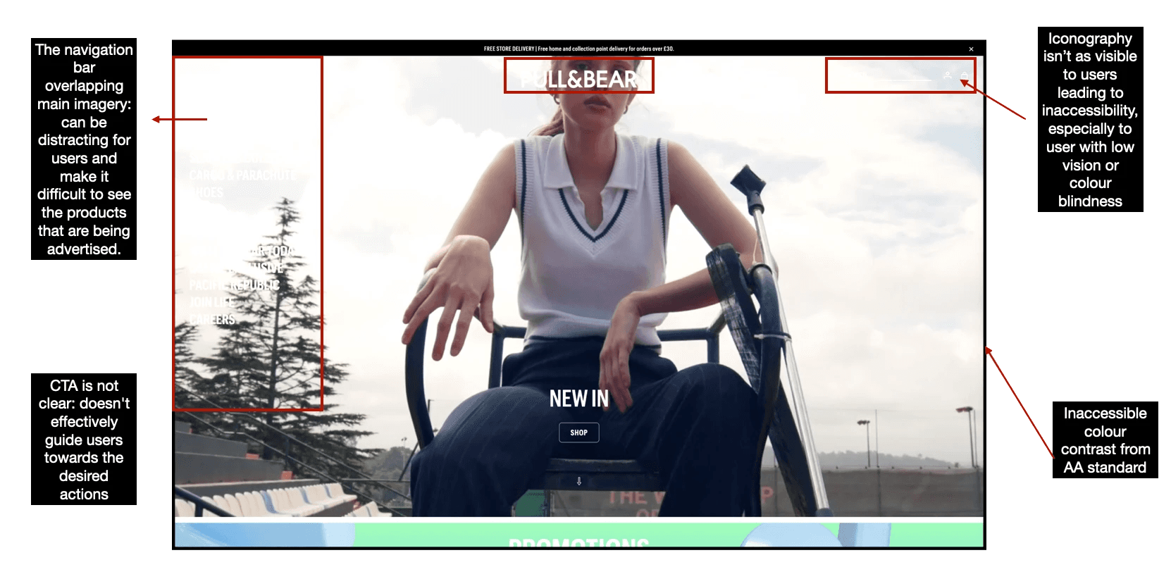
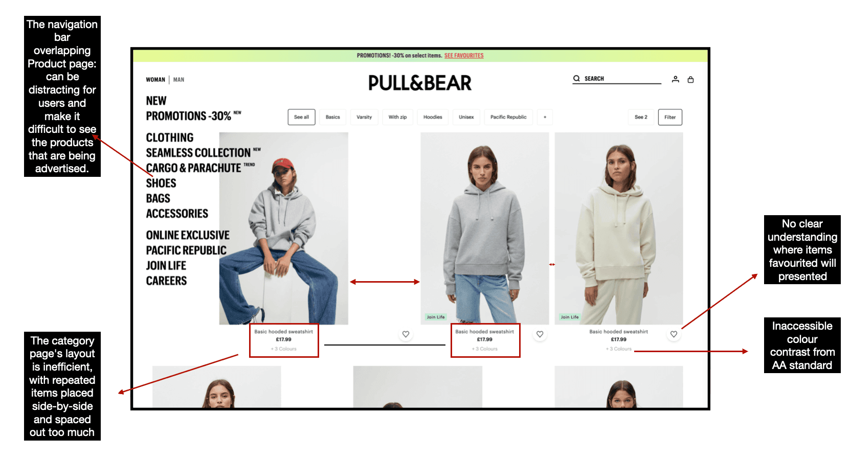
The inaccessible colour contrast from AA accessibility standards makes it difficult for users to find what they're looking for.
Not having a clear distinction of CTA makes it difficult for users to understand what action to take next in their user journey.
Presenting a clear layout structure allows users to navigate smoothly.
Not having clear, visible iconography makes it difficult for users to find the information they're looking for
Key Findings:
Inaccessible colour contrast from AA accessibility standards - makes it difficult for users to find what they're looking for
Not having a clear distinction of CTA - be difficult for users to understand what action to take next in their user journey
Presenting a clear layout structure - allows users to navigate smoothly.
Not having clear visible iconography - makes it difficult for users to find the information they're looking for.
Key Findings:
The inaccessible colour contrast from AA accessibility standards makes it difficult for users to find what they're looking for.
Not having a clear distinction of CTA makes it difficult for users to understand what action to take next in their user journey.
Presenting a clear layout structure allows users to navigate smoothly.
Not having clear, visible iconography makes it difficult for users to find the information they're looking for
Red Route Analysis
Red Route Analysis
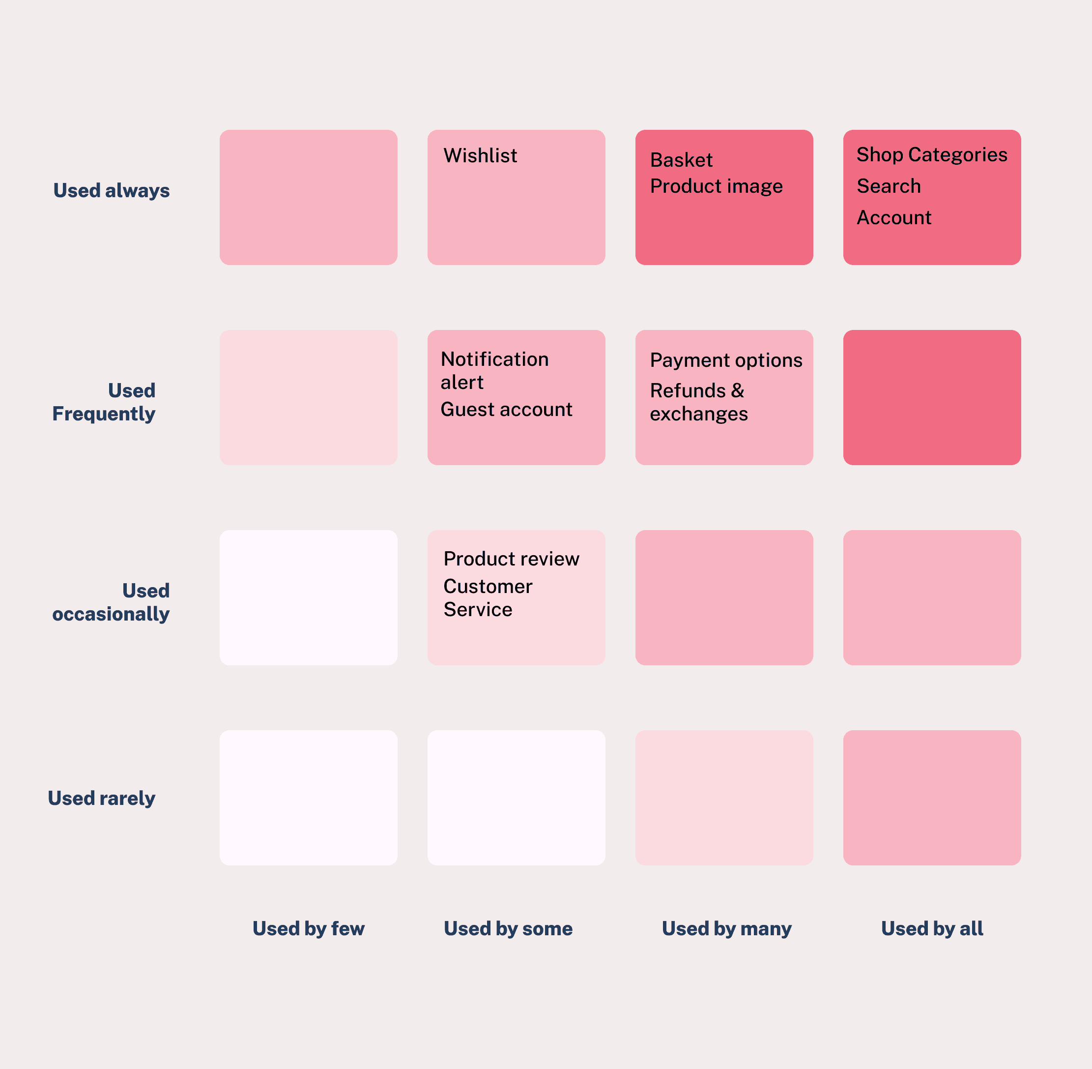
Through secondary research and competitive analysis, I was able to identify key user journeys and interactions common across fashion e-commerce websites. This research supports my understanding of the critical touchpoints and functionalities that users prioritise when shopping online.
Through secondary research and competitive analysis, I was able to identify key user journeys and interactions common across fashion e-commerce websites. This research supports my understanding of the critical touchpoints and functionalities that users prioritise when shopping online.
Through secondary research and competitive analysis, I was able to identify key user journeys and interactions common across fashion e-commerce websites. This research supports my understanding of the critical touchpoints and functionalities that users prioritise when shopping online.


Survey
Survey
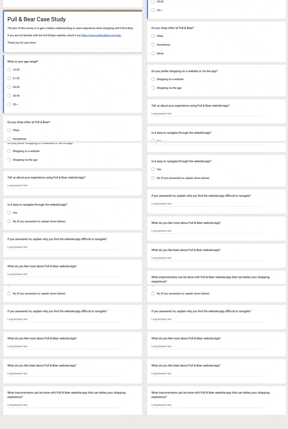
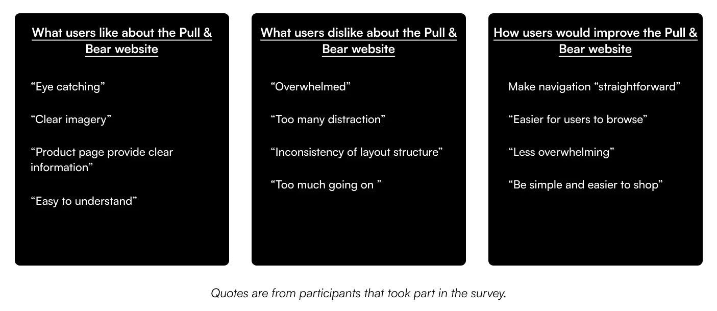
I conducted a UX survey to gain further understanding and information about users’ pain points when navigating through the Pull & Bear website, to gain a better understanding of users’ behaviour and attitude towards their frustration when shopping online. I used a mix of open and closed questions to focus on users' experiences browsing the site.
I conducted a UX survey to gain further understanding and information about users’ pain points when navigating through the Pull & Bear website, to gain a better understanding of users’ behaviour and attitude towards their frustration when shopping online. I used a mix of open and closed questions to focus on users' experiences browsing the site.
I conducted a UX survey to gain further understanding and information about users’ pain points when navigating through the Pull & Bear website, to gain a better understanding of users’ behaviour and attitude towards their frustration when shopping online. I used a mix of open and closed questions to focus on users' experiences browsing the site.
Key Findings:
Key Findings:
Key Findings:


Define
Define
User Personas
User Personas
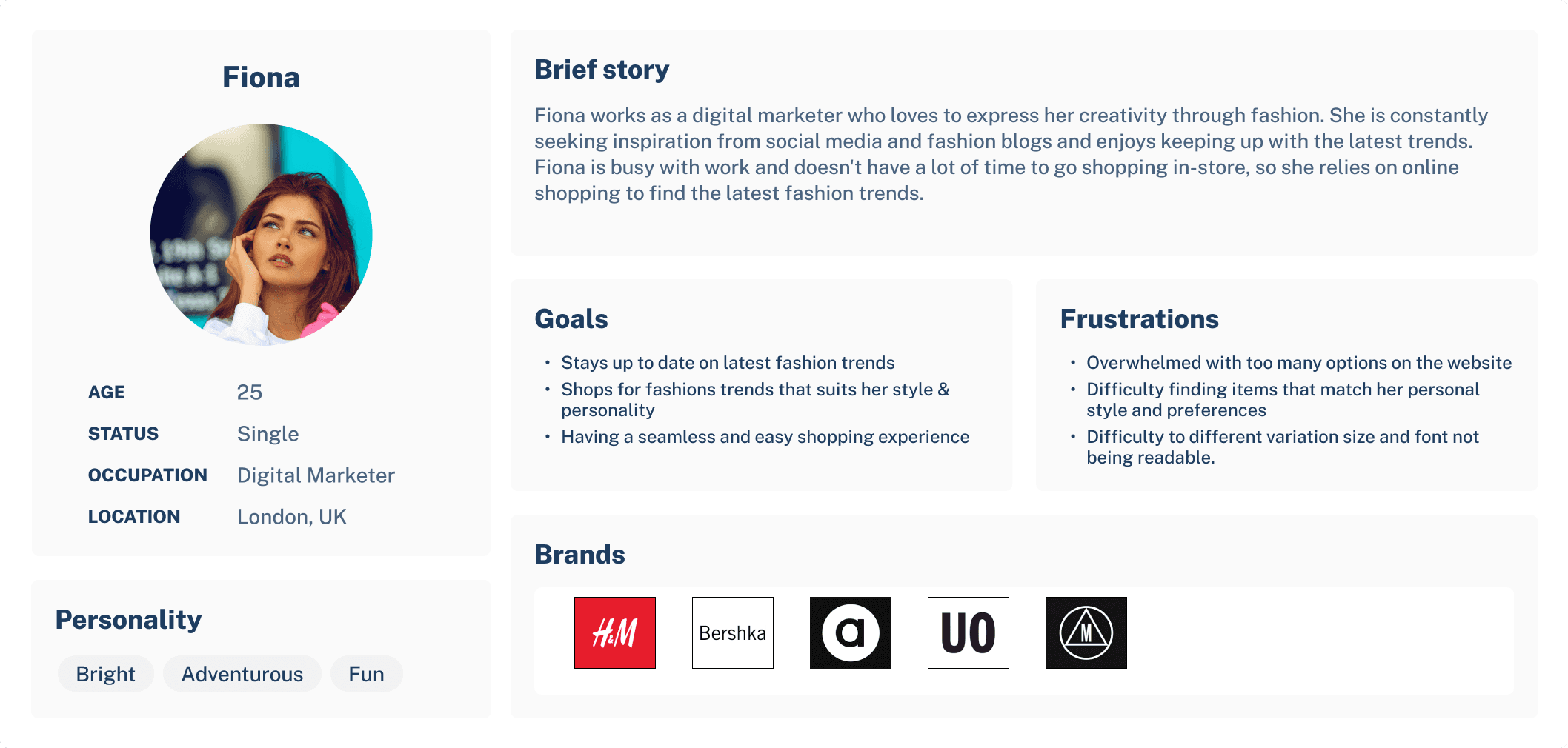
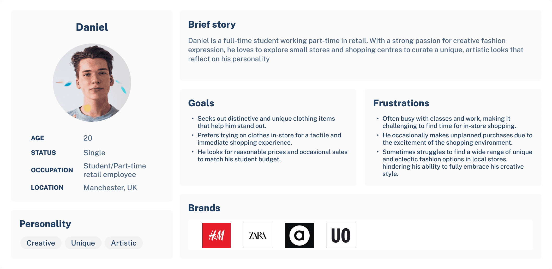
I created two user personas based on my research, taking into account the different shopping behaviours of online shoppers and those who prefer a hybrid combination of online and in-store shopping experiences. This ensures that my design solution is user-focused and addresses the pain points of the different user groups, which will help me in my ideation phase.
I created two user personas based on my research, taking into account the different shopping behaviours of online shoppers and those who prefer a hybrid combination of online and in-store shopping experiences. This ensures that my design solution is user-focused and addresses the pain points of the different user groups, which will help me in my ideation phase.
I created two user personas based on my research, taking into account the different shopping behaviours of online shoppers and those who prefer a hybrid combination of online and in-store shopping experiences. This ensures that my design solution is user-focused and addresses the pain points of the different user groups, which will help me in my ideation phase.




Ideation
Ideation
Mind Map
Mind Map
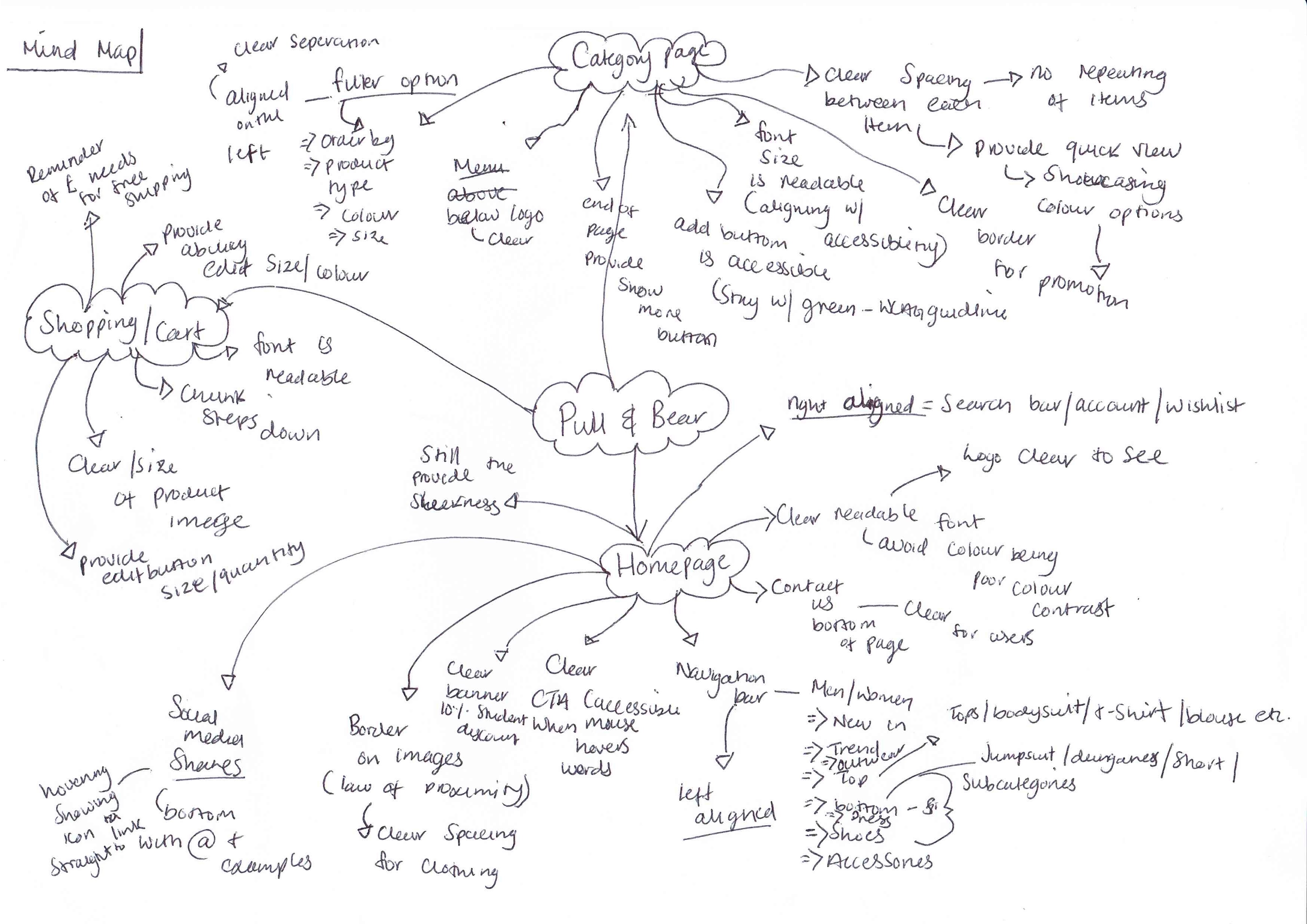
After my research, I’ve chosen to create a mind map to gather my thoughts and ideas ensuring that I tackle all pain points that I’ve gathered through my research.
After my research, I’ve chosen to create a mind map to gather my thoughts and ideas ensuring that I tackle all pain points that I’ve gathered through my research.
After my research, I’ve chosen to create a mind map to gather my thoughts and ideas ensuring that I tackle all pain points that I’ve gathered through my research.


Crazy 8
Crazy 8
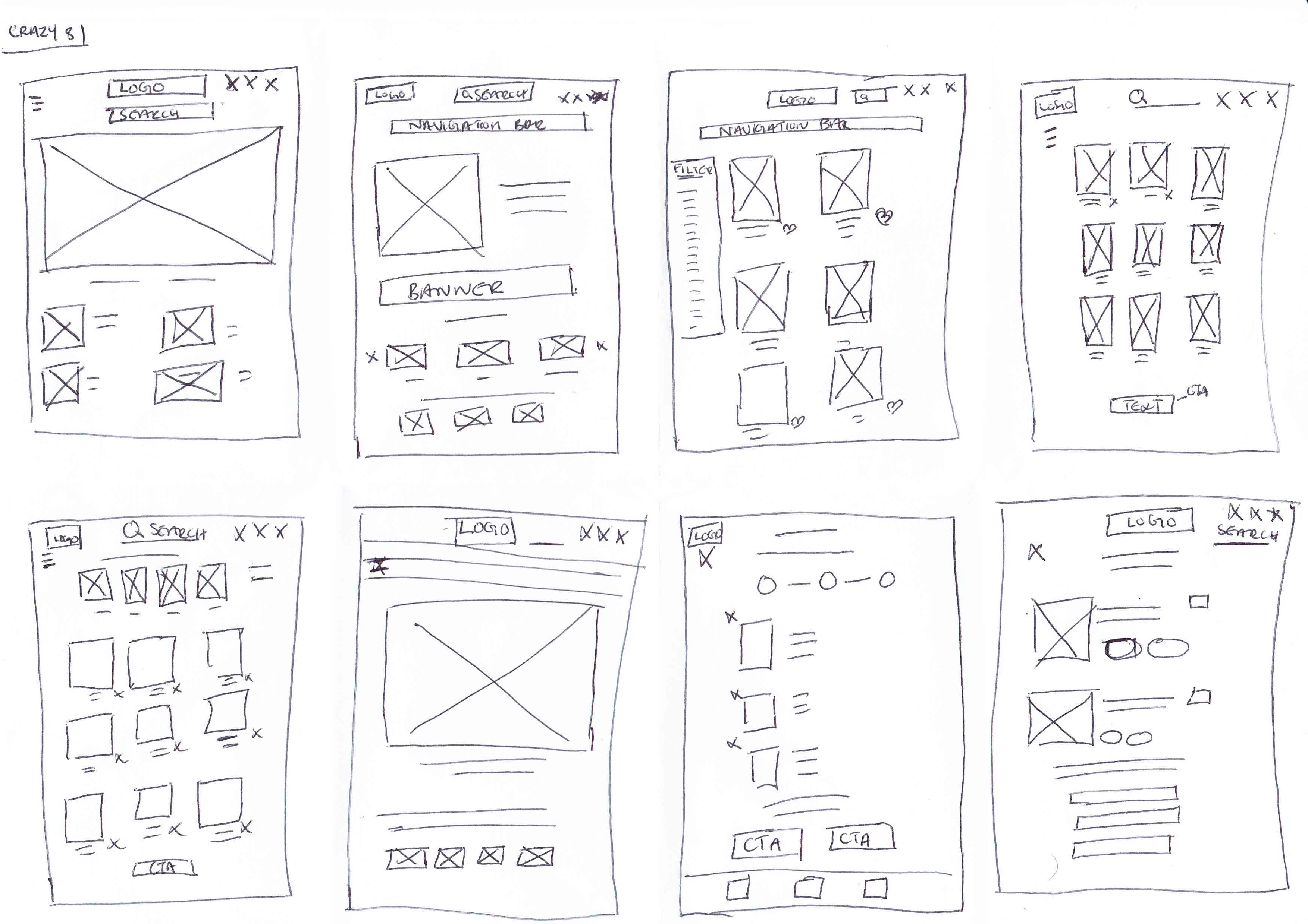
The crazy eight technique was used as a method in my ideation phase to gather potential ideas for my redesigning of the homepage, category page and checkout page. The aim was to design multiple different solutions based on my user research.
The crazy eight technique was used as a method in my ideation phase to gather potential ideas for my redesigning of the homepage, category page and checkout page. The aim was to design multiple different solutions based on my user research.
The crazy eight technique was used as a method in my ideation phase to gather potential ideas for my redesigning of the homepage, category page and checkout page. The aim was to design multiple different solutions based on my user research.


Low Fidelity Wireframe
Low Fidelity Wireframe
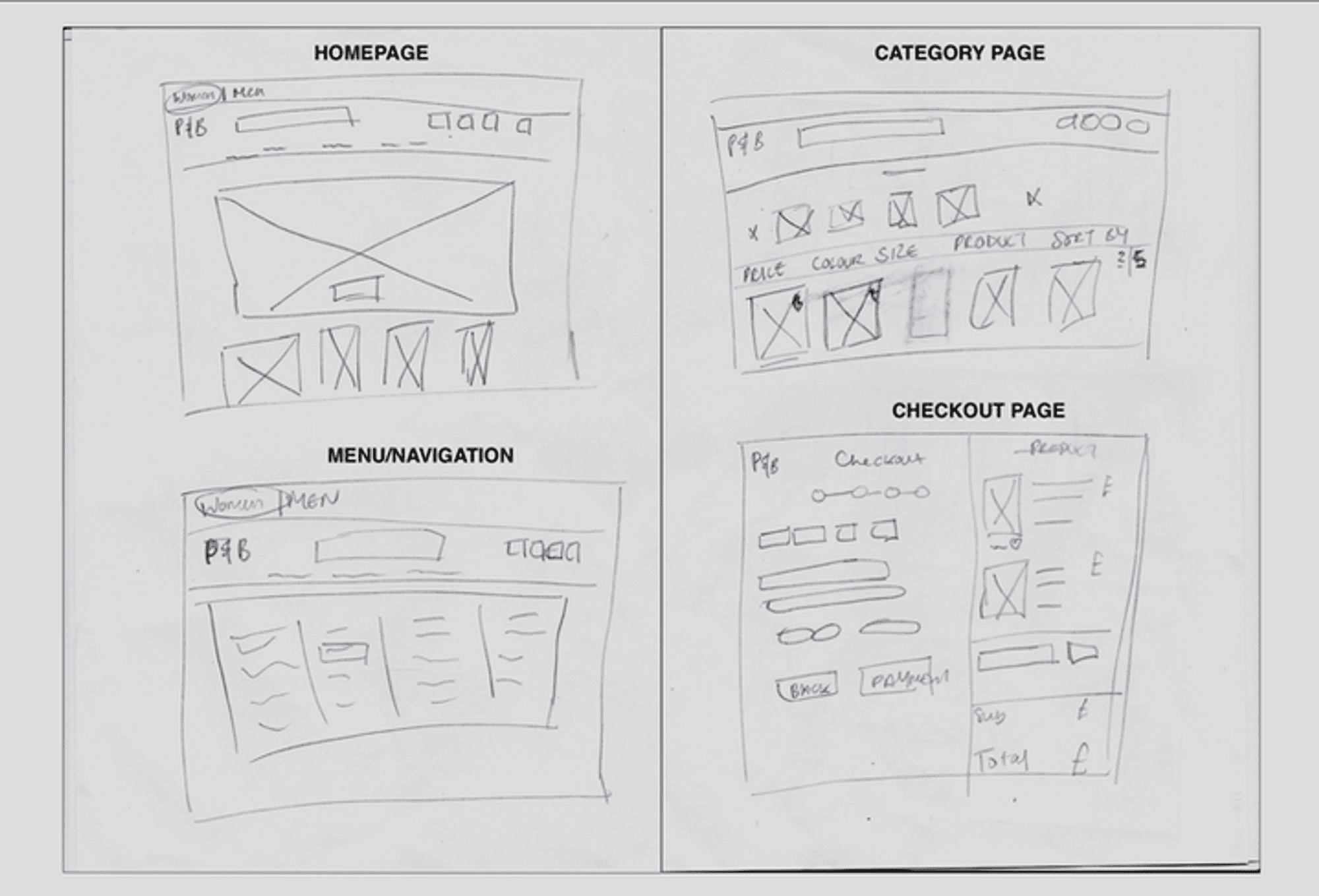
Building upon mind mapping and crazy eight, for my low-fidelity I sketched out the overall layout structure of my design for the website. Here, I ensure the design draws back to the insights gathered from the user research.
Building upon mind mapping and crazy eight, for my low-fidelity I sketched out the overall layout structure of my design for the website. Here, I ensure the design draws back to the insights gathered from the user research.
Building upon mind mapping and crazy eight, for my low-fidelity I sketched out the overall layout structure of my design for the website. Here, I ensure the design draws back to the insights gathered from the user research.


Mid Fidelity Wireframe
Mid Fidelity Wireframe
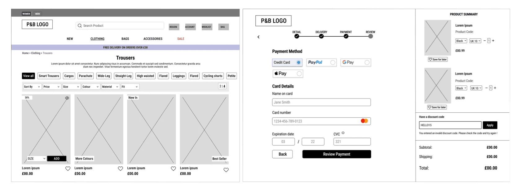
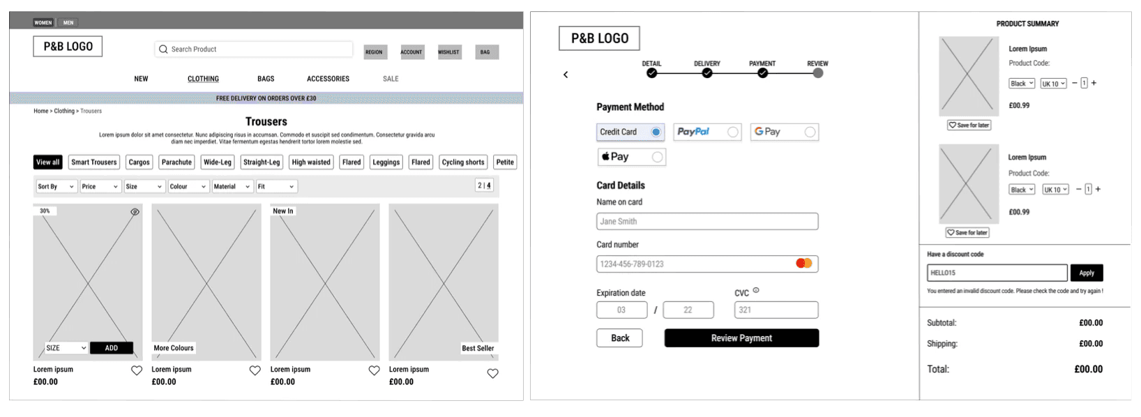
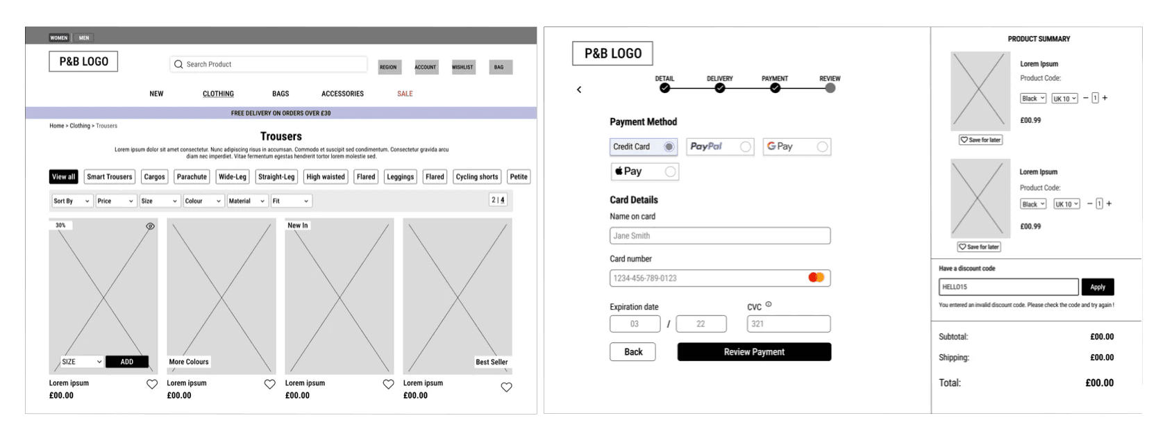
The mid-fidelity wireframes were created on Figma. I focused on the alignment and placement of my design, incorporating elements to give a clear representation of the feel and look of the design such as the position of the test box, image and iconography.
The mid-fidelity wireframes were created on Figma. I focused on the alignment and placement of my design, incorporating elements to give a clear representation of the feel and look of the design such as the position of the test box, image and iconography.
The mid-fidelity wireframes were created on Figma. I focused on the alignment and placement of my design, incorporating elements to give a clear representation of the feel and look of the design such as the position of the test box, image and iconography.


High Fidelity Wireframe
High Fidelity Wireframe
High Fidelity Wireframe




Design System
Design System
Design System


Accessibility
Accessibility
Throughout the design process, accessibility was at the forefront of my redesign:
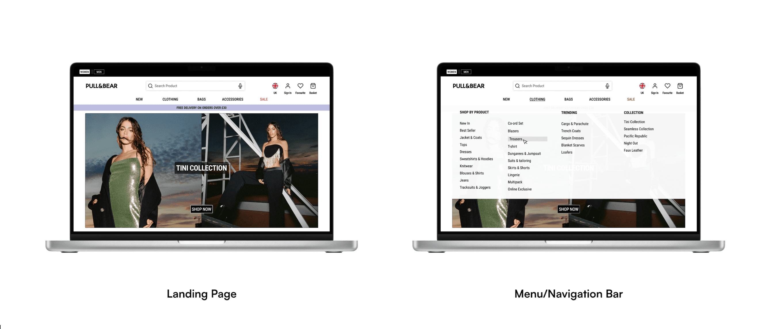
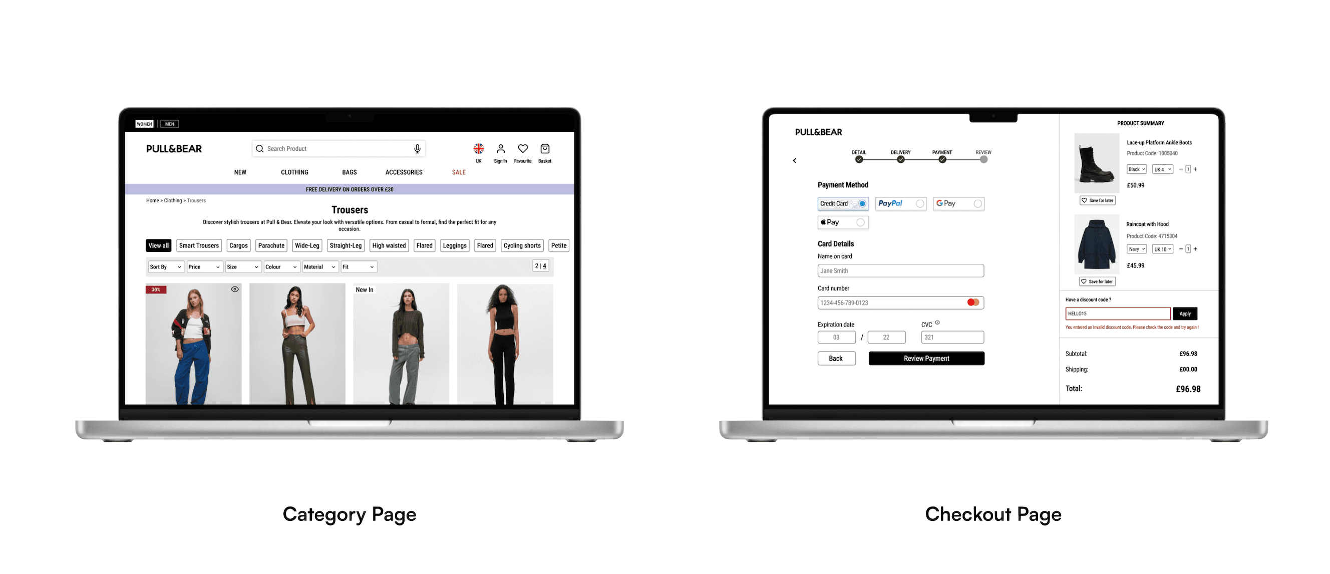
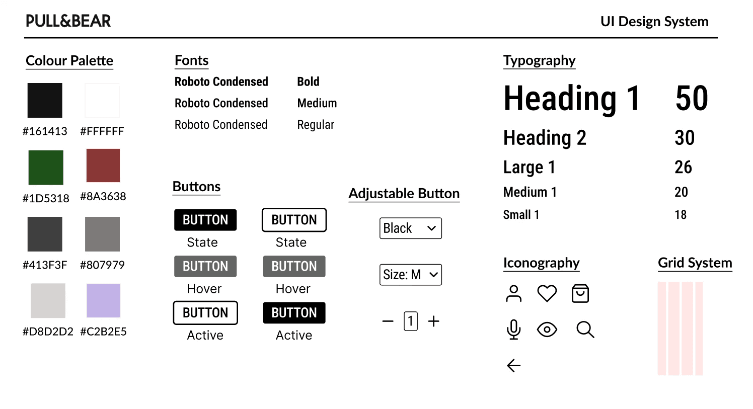
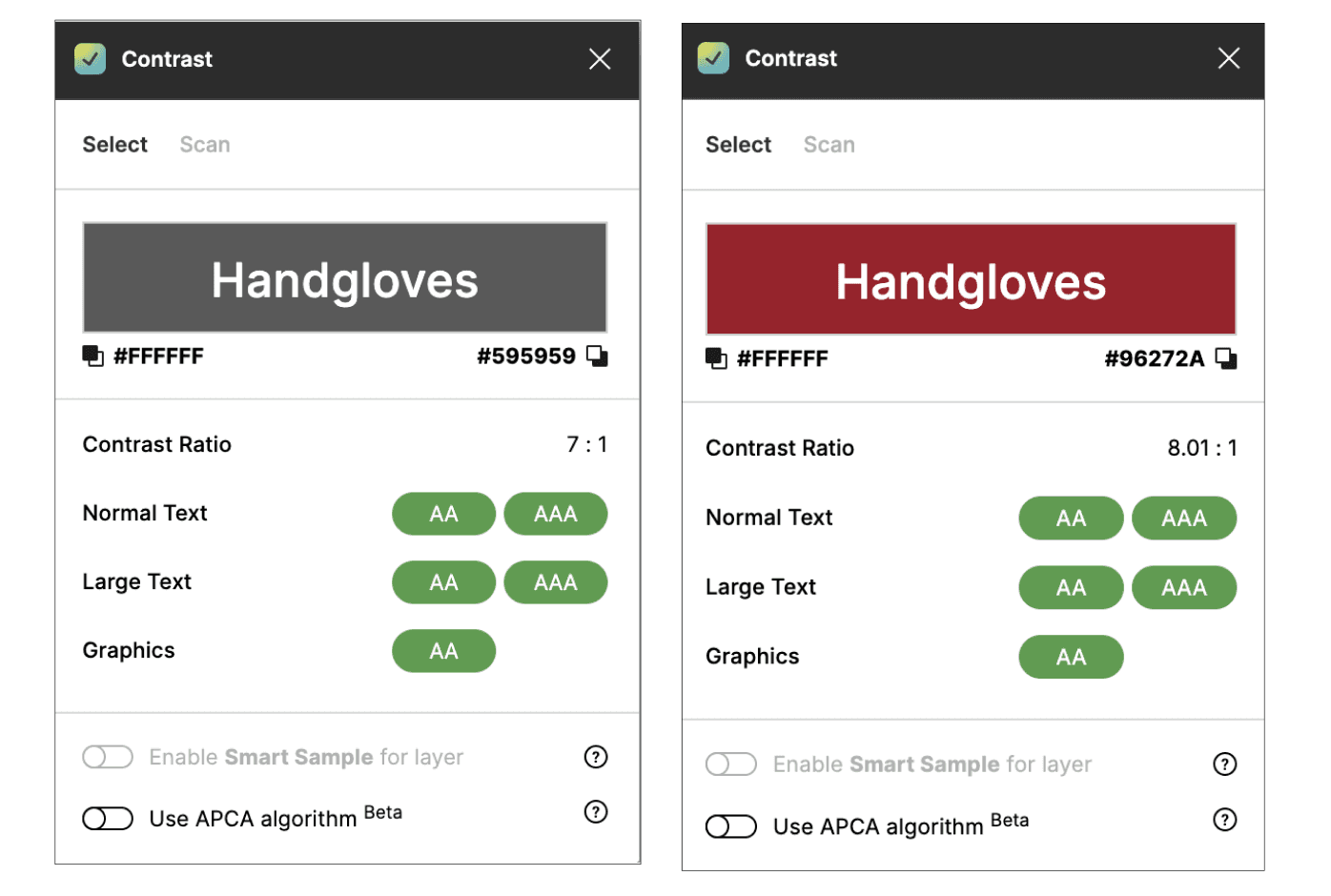
Kept the same colour scheme with adjustments to some colours to align with WCAG 2.1 AA standards. To check, I used the contrast checker Figma plugin.
Provided a clear distinction between active and inactive CTA on the site
Adding dictation in the search bar to allow users to enter text by speaking into a microphone. This can be helpful to users with limited mobility.
Provided the option to change languages to the Pull & Bear site as it's a global brand that reaches a global audience of users who enjoy shopping with Pull & Bear.


Test
Test
User Feedback
User Feedback
I presented my redesign during the wireframe stage of my design process and presented the final product to a user who is a lover of online shopping and who had participated in the survey. I intended to gather their thoughts on my redesign.
"The new layout makes it easier to navigate and find specific products"
Reflection
Reflection
I thoroughly enjoyed delving deep into this design project and creating designs, especially with accessibility in mind. I was able to apply the knowledge such as UX laws and accessibility standards learnt from my product design course and apply it to my design. I understood that the design process was not perfect as I went through many changes along the way. In the end, I am happy with how the designs turned out as believe I fulfilled the needs of users and the objective of this project.
If I had more time and develop this project further, I would have liked to solve more problems such as the user journey in making returns and finding a better way to make it easier for users. In addition, I would have liked to have conducted further testing such as A/B testing where I would have liked to compare the performances to which design would perform better amongst users.
Have a project in mind?
Let's bring your design vision to life.
Have a project in mind?
Let's bring your design vision to life.
Have a project in mind?
Let's bring your design vision to life.
Have a project in mind?
Let's bring your design vision to life.